
Popular applications do not owe their success to the fact that they only do what they are functionally supposed to do. Successful applications do so in an intuitive, efficient and ideally even fun to use way. You might have stumbled upon the terms User Experience (UX) and Usability. While often used synonymously, they bear a different meaning. There are many articles that take up that issue and illustrate the differences and similarities between the two terms. In fact, this article won’t go without at least a short definition and classification of User Experience and Usability. However, beyond that, it is supposed to give a short introduction on how to create usable, fashionable and fun to use applications by going into the design process and thus trying to provide you with an appropriate mindset in order to create applications with high usability and a good User Experience yourself.
The need for good Usability and User Experience applies to every kind of technology that provides an interface to human users, be it software, websites, mobile devices, yada-yada-yada…
When going into detail, this article is concentrating on desktop applications. Providing Usability and User Experience in mobile applications is a completely different story, which involves different considerations like screen real estate, unstable internet connectivity and so forth. This topic might be covered in a future blog entry.
Definitions, definitions, definitions!
You stumble upon it in articles or in conversations – people are talking or writing about User Experience while they actually mean Usability and – occasionally – vice versa. In fact, the two terms are often mistaken as synonyms. So let’s define them in a nutshell.
Usability in a nutshell
In ISO 9241-11 usability is described as the extent to which a product can be used by specified users to achieve specified goals with effectiveness, efficiency and satisfaction in a specified context of use.
So, when it comes to determining an application’s usability, we have to put the questions
- Who uses the application?
- What are the user’s/users’ goals?
- Can those goals be fulfilled effectively and efficiently?
- Can the goals be fulfilled satisfactorily, i.e. not frustratingly?
- Does the application suit the context it is used within?
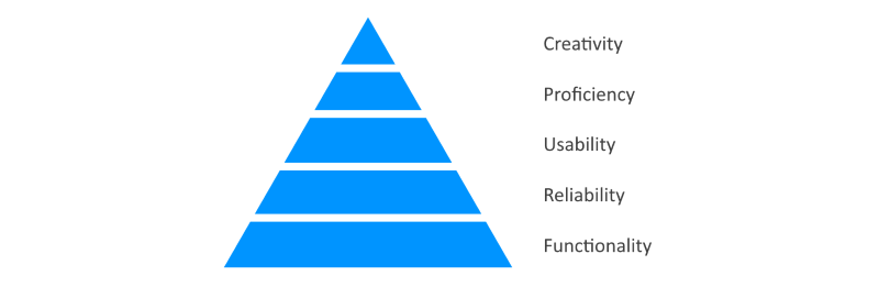
According to William Lidwell’s[^n] Design Hierarchy of Needs usability depends on functionality and reliability, which means that a tool or application has to provide the functionality to actually fulfil a goal and do so in a predictive and reliable way to allow for good usability. At the same time usability serves as the base for the proficiency and creativity an application can offer.
User Experience (UX) in a nutshell
In DIN EN ISO 9241, 210 User Experience is described as "A person’s perceptions and responses that result from the use and/or anticipated use of a product, system or service".
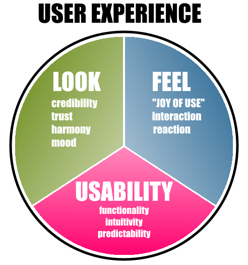
As illustrated in the figure, User Experience complements usability with the aesthetical and emotional aspects Look and Feel. It comprises the whole experience being lived while using a product or an application.
The Aesthetic-Usability Effect describes the phenomenon that aesthetic designs are perceived as easier to use than less aesthetic designs. Aesthetic designs have a higher probability of being used, whether or not they actually are easier to use. The effect shows that usability might not be enough in order to design a good interface.
A reminder: In order to ensure good usability we try to find an answer to the question on how to accomplish a specific task in the most efficient way.
When it comes to User Experience or Experience Design different questions are being asked.
- Which feature of x is fun?
- Which detail of y bears a meaning for the user?
- Which needs are supposed to be satisfied?
- How can I evoke or intensify a specific experience with the help of technology?
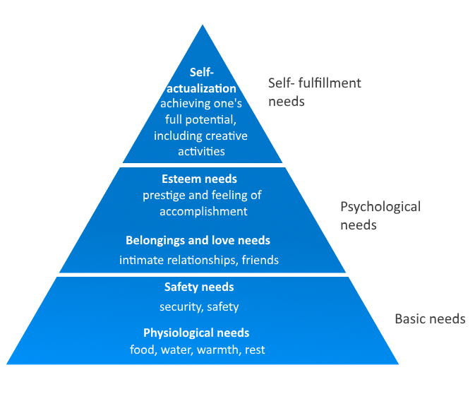
So, to ensure User Experience, people try to evoke experiences or satisfy the users’ needs. There are many situations in which one or multiple specific needs are standing in the foreground. Those needs are called Experience Categories.
For example, a user’s joy can be triggered by
- Expertise – "I am good at what I’m doing"
(Confidence, Control, Effectivity, Ability, Efficiency) - Connectivity – "I feel connected to the people that are important to me" (Family, Romance, Community, Solidarity, Friendship, Familiarity)
- …
Those needs are tried to be satisfied with UX. They correspond to the psychological needs in Abraham Maslow’s[^n] hierarchy, as illustrated below.
A Guide to Usability
Good usability stands out by not standing out. Wait. What? It means, that only bad usability is actually perceived, while good usability is generally taken for granted. This section is supposed to provide some advice on how to achieve good, thus inconspicuous, usability.
Nielsen’s Ten Usability Heuristics[^n] define a list of principles which are often quoted in the context of usability. These heuristics can be thought of as a rule of thumb for creating usable interfaces. They comprise the following points.
1. Visibility of system status (Feedback)
The system’s currents status should always be visible. For example, when we see a loading indicator, we know that data needs to be loaded in the background. Appropriate headings help us navigate within applications.
2. Match Between System and the Real World
The system should speak the users’ language, for example, by using real world metaphors. Users usually know what to do with elements like a trash bin, folders and bookmarks.
3. User Control and Freedom
Users should be provided with the ability to undo mistakes and to leave unwanted application states straightforwardly.
4. Consistency and Standards
A figurative list to underline the importance of consistency
a) Platform conventions should be followed.
2) Stick with standard fonts and colors, if possible
III) Stick with only one style for lists ;-)…
5. Error Prevention
Murphy’s Law states that "If there’s more than one possible outcome of a job or task, and one of those outcomes will result in disaster or an undesirable consequence, then somebody will do it that way." This law by Edward Aloysius Murphy Jr. (1949) can also be applied to usability design. Human errors should be prepared for by doing sanity checks, providing useful defaults and making sure that serious mistakes hard to make. For example, users should be allowed to insert phone numbers and banking information in different formats.
6. Recognition rather than Recall
This cryptic rule states that the users’ memory load should be minimized. For example, available actions or commands should be visible and should not have to be memorized by the user.
7. Flexibility and Efficiency of Use
Usable user interfaces are flexible. It is recommended to provide more than one way for a user to achieve her goal. For example, for copying elements allow for using the shortcut ctrl-c while still providing a respective button to navigate to with a pointing device or finger. Shortcuts or other accelerators, speed up the interaction with the system, but have to be learnt by the users beforehand.
8. Aesthetic and Minimalist Design
This rule can be regarded from two different levels of abstraction.
On application level, the more functionality an application offers, the less efficient a specific function can be performed. This tradeoff is called the flexibility-usability tradeoff and is exemplified in the figure of speech "Jack of all trades, master of none". Of course we could use a Swiss army knife in order to assemble an IKEA shelf, but there might more suitable tools to do so.
On design level, simple designs allow for rapidly apprehending and understanding an interface well enough to support intuitive use or invite to further exploration, referred to as approachability. Moreover, as they present less visual information to the viewer, simple designs can be understood and remembered more easily than their packed counterparts, which can be understood as recognisability.
9. Help Users Recognize, Diagnose, and Recover from Errors
If, despite the efforts made, an error message needs to be displayed, the message should be specific and polite and should offer a proposal for solution.
10. Help and Documentation
Even though it is better to create a system which goes without documentation, providing help might be necessary in some cases. This kind of information should be concise, easy to search and focused on the tasks the user is currently carrying out.
The ten heuristics by Nielsen illustrate a very high-level view on usability criteria. You could go down to very detailed levels where topics like positioning, coloring and design of concrete UI controls are covered. This would defeat the purpose of this article and is a science in itself. It might be covered in a future article.
From User-Centered Design to Experience Design
User-Centered Design
When it comes to designing an application with good usability, User-Centered Design is the classical approach to get there. It puts emphasis on the users’ needs within a specific context of use. User-Centered Design describes an iterative approach of four phases.
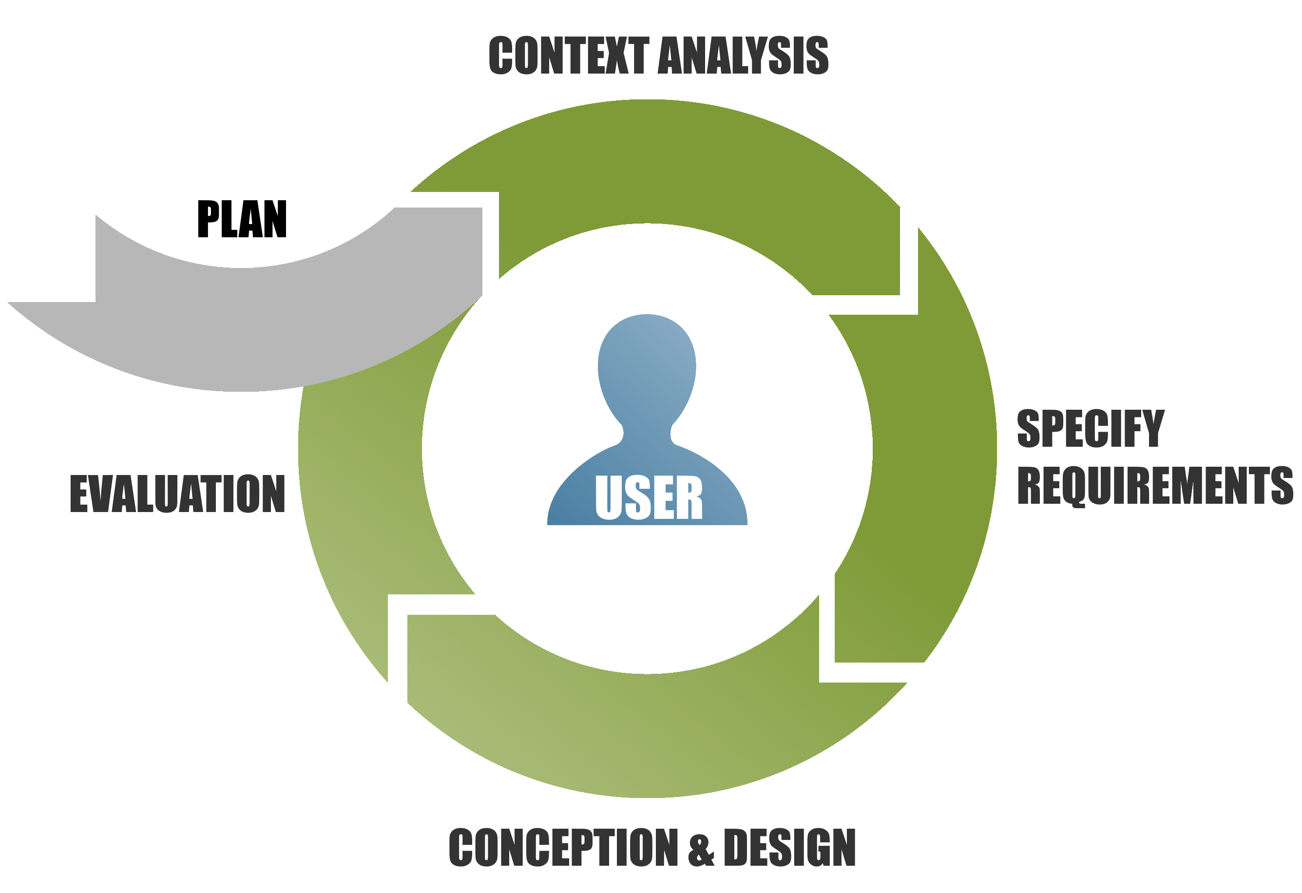
In the Context Analysis phase, information about the users and their specific tasks is gathered, as well as about the context, a tool, device or application will be used within.
Specify Requirements. Based on the findings of the Context Analysis, requirements are being defined that are to be implemented in the design process.
The Specify Requirements phase is followed by Conception and Design, where concepts are developed and elaborated. This phase results in a complete design with mockups and paper prototypes.
In the last phase, Evaluation, the designs, mockups and prototypes are discussed with and tested with users. This serves to make sure that the requirements are actually met.
Experience Design
In Experience Design, however, instead of putting emphasis on the users’ needs, the possibilities are in the foreground. Experience Design deals with the question on how to deliberately create and shape experiences. It addresses the "How" of product use, the aesthetics of an interaction, instead of settling for the "What". It is not only important that something is done as expected, but also how. Basically, the iPhone is just a mobile phone that provides the same functionality as any other mobile phone. It owes its success to its unique and intuitive look and feel.
As mentioned above, the interaction with a product can be looked at from a number of different perspectives, namely the Why, the What and the How perspective.
The What describes what users can do with a tool or an application, like "book a flight", "watch funny cat videos", …, i.e. the functionality of an interactive product.
The How, in contrast, deals with the interaction with a product on an operational level, like buttons that have to be pressed, knobs to be turned, and so forth. This is the topic interaction designers usually deal with. They aim at making a given functionality accessible and usable in an aesthetical and pleasing way. The two factors What and How can be considered the product. What is still missing, is the Why, the actual motivation to use a product.
As an example, let us have a look at PCs. For the users, a PC is not a primarily a technical device to run computer games or chat applications or to access dating websites. Instead, they are experienced as a mean of escaping the everyday, maintaining long distance relationships or even find the love of one’s life. This corresponds to the Why of using a product.
If you think of a "keep-in-touch experience" or a "find-love experience" instead of a chat application or a dating website, this opens up a whole new design space for new products and applications.
Experience Design starts from the Why by finding out about the users’ needs and about the emotions and experience they are accompanied by. Subsequently, the kind of functionality (What) is determined which is able to support the experience, followed by the considerations on how to realize it (How).
Conclusion
This article intends to classify the terms Usability and User Experience, which are often confused or used synonymously. While usability describes whether a tool or an application is able to offer the desired functionality in an effective and efficient way, User Experience complements usability with the factors Look and Feel which make a product interesting and fun to use.
Usability Design, respectively User-Centered Design follows some rules that are to be met in order to allow for efficient use of a product. Experience Design, however, puts emphasis on the experiences and feelings which go together with using a tool or an application.
In future articles, we will go into more detail concerning usability and UX. There are many low-level aspects, such as coloring, size and alignment of controls, fonts, yada-yada-yada, which might be covered in those articles. Those articles will be referenced here.
Further reading
Usability Geek offers tons of inspiration sources, ideas on how to design usable and good-looking components of an application and presents tools for Usability and UX Design.
Just like Usability Geek, Webdesigner Depot provides articles, ideas and tools for efficient and impressive Usability and UX solutions.
Sources
[^n]: Lidwell, J. B. W. (2010). Universal Principles of Design, Revised and Updated: 125 Ways to Enhance Usability, Influence Perception, Increase Appeal, Make Better Design Decision. Rockport.
[^n]: Maslow, A. (1943). A Theory of Human Motivation. In Psychological Review, Vol. 50 #4, 370–396
[^n]: Nielsen, J., and Molich, R. (1990). Heuristic evaluation of user interfaces, Proc. ACM CHI’90 Conf. (Seattle, WA, 1–5 April), 249-256


Dein Kommentar
An Diskussion beteiligen?Hinterlasse uns Deinen Kommentar!